Between-county disparities among different causes of death – a roadmap to action
Published December 19, 2016
When it comes to how Americans die, not all counties are created equal.
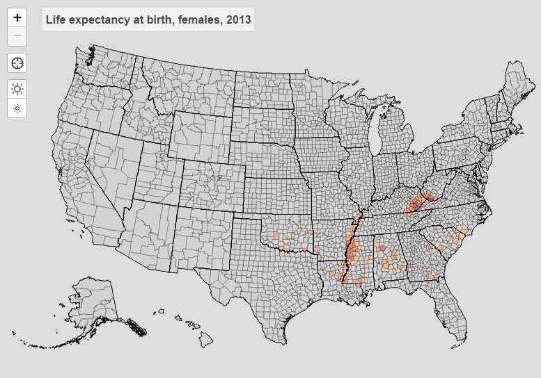
IHME’s latest estimates of county life expectancy reveal a 15-year difference between counties with the lowest and highest life expectancies for American women in 2013 – 71 years in McDowell County, West Virginia, to 86 years in Marin County, California. While McDowell County, West Virginia, also showed the lowest life expectancy for men (63 years), Fairfax County, Virginia, showed the highest at 82 – a 19-year spread. It would take just under six hours to drive from one of these counties to the other.
Last week, IHME launched a trove of updated online resources exploring causes of death at the county level that decision-makers can use to develop targeted interventions to reduce these disparities.
IHME updated its US Health Map tool, which now shows death rates for 21 causes of death and how these rates have changed between 1980 and 2014. An analysis of these estimates was published in the December 13 issue of JAMA, flagging regions of the country with alarmingly high or inspiringly low rates of death from different causes.
The stark health disparities between counties in the US – even within a single state or region – is not news to the population health community, but until now, life expectancy has acted as the primary indicator of this kind of inequality.
While life expectancy is no doubt an important indicator of health for a county, the way that Americans die and at what rate tells a more complex but potentially more useful story. For this reason, the analysis launched last week provides a powerful tool for action.
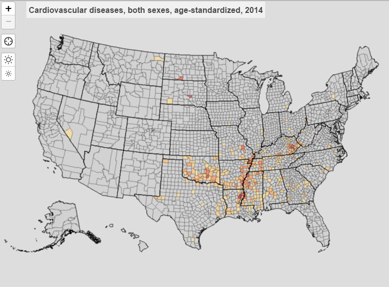
The IHME authors found that for certain causes of death in the US, geographic trends look fairly similar to that of life expectancy. For example, counties with lower life expectancy in 2013 also appeared in the clusters of counties with highest death rates from cardiovascular disease and cancer – the top two killers in the US.
 |
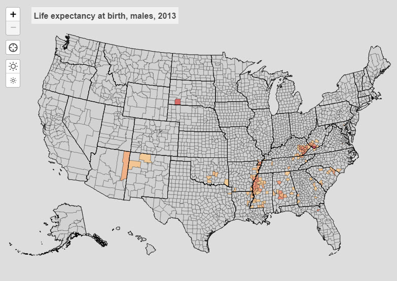 |
Counties with life expectancy below 76 for females (left) and counties with life expectancy below 70 for males (right), 2013
 |
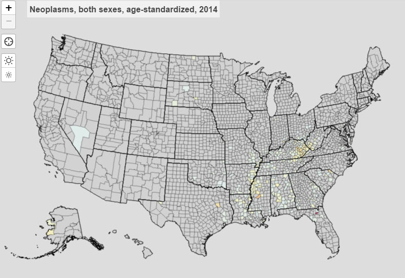 |
Counties with age-adjusted mortality rates in the 90th percentile for cardiovascular disease (left) and cancer (right), 2014
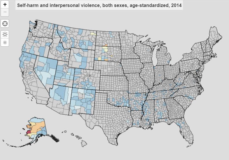
Other causes of death, however, deviated from this trend. With suicide and homicide, for example, counties in the western half of the country and in Alaska showed the highest death rates. Similarly, more Western counties showed high death rates due to cirrhosis and other liver diseases than those in the Eastern half. In Colorado, a state which can typically boast higher-than-average life expectancies among its counties, 60 people per 100,000 died of liver disease in 2014 in Alamosa County. The national rate is 22. So what is going on?
 |
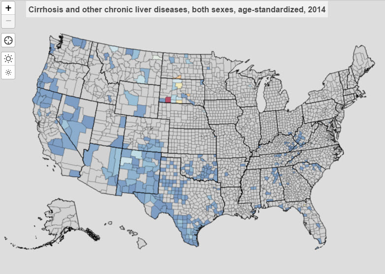 |
Counties with age-adjusted mortality rates in the 90th percentile for self-harm and interpersonal violence (left) and cirrhosis and other liver disease (right), 2014
The objective of the current study on county-level causes of death looks to answer the “what” question, prompting further research to identify the “why” (or “whys”), but we do have some educated guesses.
Laura Dwyer-Lindgren, the lead author on the study, puts it this way: “While our team did observe trends based on geography, differences in risk factors, socioeconomic conditions, and quality and access to care are likely among the driving factors for certain causes of death.”
By making this information accessible to the public, the team at IHME hopes that these cause-specific morality estimates will be put to good use, giving a voice to communities seeking a response to their health needs. Here are just a few ways that these new estimates can prompt change:
- Health departments at the state and county levels could use cause-specific estimates to single out pressing local needs, tailoring future policies and programs to address the unique problems of unique communities.
- Doctors and hospital administrators could look to these estimates to better understand the health concerns and needs of the cities and counties they serve.
- Research teams could identify counties that have done either particularly well or particularly poorly for certain causes of death and conduct studies that seek to identify the drivers of these trends. These estimates also provide a tool for evaluating the effects of certain policies and programs over time.
- Communities can point to these estimates to call attention to the biggest health concerns in their counties when advocating for change.
To see the results for your community, explore the results for your county in our County Profiles, or examine the trends visually using our interactive US Health Map. Estimates on US county-level mortality trends can also be downloaded from the US Data page on the Global Health Data Exchange (GHDx).