GBD India Compare
Updated October 8, 2020
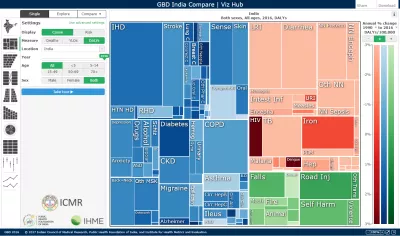
Analyze data about India’s health levels and trends from 1990 to 2019 in this interactive tool. Use treemaps, maps, arrow diagrams, and other charts to compare causes and risks and explore patterns and trends by age and sex. Drill from a national view into specific details. Compare expected and observed trends. Watch how disease patterns have changed over time. See which causes of death and disability are having more impact and which are waning.
Citation
Indian Council of Medical Research, Public Health Foundation of India, and Institute for Health Metrics and Evaluation. GBD India Compare Data Visualization. New Delhi: ICMR, PHFI, and IHME; 2020. Available from http://vizhub.healthdata.org/gbd-compare/india (Accessed [INSERT DATE])
Browser notes
- Use the latest version of Chrome, Edge, Safari, or Firefox.
- Use Ctrl+0 to reset the browser zoom. Sometimes having the browser zoomed in or out interferes with the layout or a few mouse-dependent properties.
- If the visualization isn't loading or looks distorted, try clearing your cache. See http://www.wikihow.com/Clear-Your-Browser's-Cache for pointers.