Diet
Diet plays a significant role in non-communicable diseases such as cardiovascular disease, diabetes, and cancer. As policy, economic, social, and environmental forces change diets over time, our work allows policymakers and others to explore the link between components of diet and population health.
Photo by Filip Milovac.
3rd highest risk
group contributing to the global burden of disease in 2019, following high blood pressure and tobacco.
1.9 million
deaths globally were attributable to high-sodium diets in 2019.
22%
of all adult deaths in 2017 were associated with poor diet, with cardiovascular disease as the leading cause of death associated with diet.
Interactive data visuals
GBD Compare
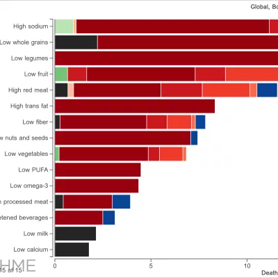
Compare the impact of various dietary risks like high sodium, low whole grains, and more.
Burden of Proof
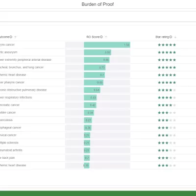
Explore the strength of evidence behind various health outcomes associated with diets high in red meat and low in vegetables.
Datasets in our catalog
Visit the Global Health Data Exchange (GHDx) to download our estimates and view data sources for measuring dietary risks.
Global Burden of Disease Study 2019 (GBD 2019) Burden by Risk 1990-2019
Estimate
Global Burden of Disease Study 2019 (GBD 2019) Burden by Risk 1990-2019
United States USDA Food and Nutrient Database for Dietary Studies (FNDDS)
Estimate
United States USDA Food and Nutrient Database for Dietary Studies (FNDDS)
Italy National Survey on Food Consumption 2005-2006
Survey
Italy National Survey on Food Consumption 2005-2006
Peru National Survey on Nutritional, Biochemical, Socioeconomic Indicators Related to Chronic Degenerative Diseases 2004-2005
Survey
Peru National Survey on Nutritional, Biochemical, Socioeconomic Indicators Related to Chronic Degenerative Diseases 2004-2005
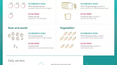
Health effects associated with vegetable consumption