
United States (US) health
About $4.3 trillion of the $10 trillion spent on health globally is in the US. Despite this huge investment, there are still wide disparities in health and health spending across the country.
$550 billion
was spent in 2016 on diabetes, low back and neck pain, other musculoskeletal disorders, ischemic heart disease, and injuries from falls.
18.5 years
for females and 23.7 years for males is the calculated life expectancy disparity across states in 2019.
950,000 deaths
per year in the US are due to cardiovascular diseases, but not equally across races and ethnicities.
60.1%
of disease combinations had super-additive spending. This means that having more than one chronic condition leads to even more healthcare spending than two people each having a chronic condition.
Interactive data visuals


Datasets in our catalog
Visit the Global Health Data Exchange (GHDx) to download our estimates and data sources for the United States.
United States COVID-19 Resiliency Estimates 2020-2022
Dataset
United States COVID-19 Resiliency Estimates 2020-2022
Rotavirus Vaccination Cost Effectiveness Estimates 2017
Dataset
Rotavirus Vaccination Cost Effectiveness Estimates 2017
United States Health Care Spending Effectiveness 1996-2016
Dataset
United States Health Care Spending Effectiveness 1996-2016
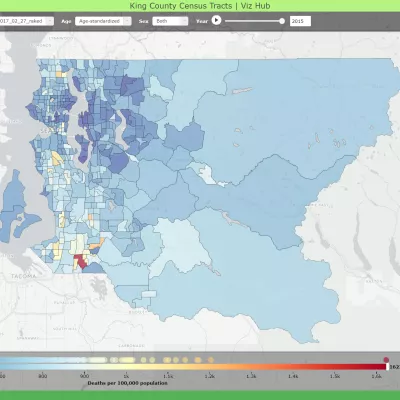
United States Mortality Rates and Life Expectancy by State, Race, and Ethnicity 1990-2019
Dataset