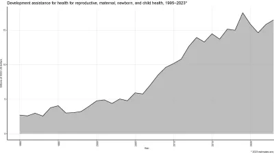
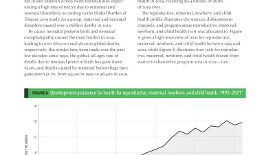
Global health financing profile of spending on reproductive, maternal, newborn, and child health from 1990 to 2020.
August 25, 2020
Infographic
This infographic describes the global spending on reproductive, maternal, newborn, and child health by country, channel, and program area.
May 17, 2016
Infographic
This Visualizing Health Metrics infographic, based on the Global Burden of Disease Study 2013 and published in JAMA, provides information on mortality for children and adolescents from four age groups, including both sexes, from 1990 to 2013. The top causes of death in developed versus developing countries, as well as mortality rates by World Health Organization (WHO) region, are illustrated.
March 1, 2016
Infographic
This Visualizing Health Metrics infographic, based on the Global Burden of Disease 2013 study, provides information on changes in mortality rates for children younger than 5 years, for both sexes, from 1990 to 2013.
May 12, 2014
Infographic
Child deaths cut nearly in half since 1990, maternal deaths by almost a quarter. Pace accelerated after Millennium Development Goals were set, yet few countries on track to meet ambitious targets.
January 21, 2014
Infographic
Globally, smoking prevalence — the percentage of the population that smokes every day — has decreased, but the number of cigarette smokers worldwide has increased due to population growth.
January 19, 2014
Infographic
Countries in the Arab world – from Saudi Arabia to Mauritania to Yemen – have made some significant health gains over the past two decades, including increases in life expectancy and swift reductions in child mortality.
December 14, 2012
Infographic
What ails you isn't necessarily what kills you. While the world has done a tremendous job battling fatal illnesses - especially from infectious diseases - we are now living with more health problems that cause a lot of pain, impair our mobility, and prevent us from seeing, hearing, and thinking clearly.
December 14, 2012
Infographic
Globally, no matter how old a person is, life expectancy is increasing. Life expectancy at birth increased 10.7 years for males and 12.6 years for females from 1970 to 2010. That's because mortality is decreasing in every age bracket, although it is decreasing more slowly among young adults.
December 14, 2012
Infographic
From left to right, you can see the top 25 causes ranked by total DALYs worldwide. The Size of the bars up or down reflects the percent changes from 1990 to 2010.
June 7, 2010
Infographic
Updated data from IHME's policy report Building Momentum: Global Progress Toward Reducing Maternal and Child Mortality show that across all regions of the world, child mortality rates are declining.
June 7, 2010
Infographic
Updated data from IHME's policy report Building Momentum: Global Progress Toward Reducing Maternal and Child Mortality show that the regions with the highest under-5 mortality rate are concentrated in the developing world.