Global Burden of Disease (GBD)
The GBD study is the largest and most comprehensive effort to quantify health loss across places and over time, so health systems can be improved and disparities eliminated.
607 billion+
Highly standardized and comprehensive estimates of health outcome and health system measures.
459
Health outcomes and risk factors, providing a powerful basis for insights on global health trends and challenges.
204
Countries and territories, plus dozens of sub-national locations show trends at regional, national, and local levels.
11,000+
Individuals from over 160 countries and territories collaborate in vetting GBD data sources and estimates.
GBD 2021 capstones
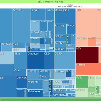
Interactive data visuals

Infographics and videos
Explore our library of infographics and videos to help you quickly share impactful stories to improve global health.


Publications
Learn more about GBD findings through health policy reports and peer-reviewed publications.
GBD data sources
Review and retrieve all GBD data sources from the Global Health Data Exchange (GHDx), the world's largest health data catalog.

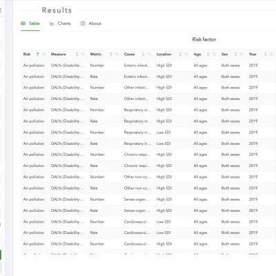
Download GBD data
Download estimates generated from studies published in scientific journals, for all rounds of GBD from 2010 to present.
Anemia Prevalence and Years Lived with Disability by Cause 1990-2021
Estimate
Anemia Prevalence and Years Lived with Disability by Cause 1990-2021
Sickle Cell Disease Birth Incidence, Prevalence, and Mortality 2000-2021
Estimate
Sickle Cell Disease Birth Incidence, Prevalence, and Mortality 2000-2021
Under-5 Mortality by Detailed Age Groups 1950-2019
Estimate