Here we summarize two new views that are available for each chart. For a more detailed walk-through, check out this video tutorial.
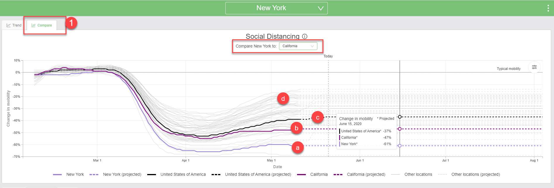
1. The Compare view allows you to compare between two locations. For countries where we have subnational estimates, you can also compare those to the national estimates, where applicable.
In the example below, we’ve chosen to compare NY to CA.
- NY is in light purple.
- CA is dark purple.
- The US is in black.
- Gray lines are all the other US states (other subnational US locations).
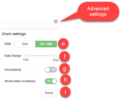
The Advanced settings at the right side of the chart allow you to:
- Switch between showing rates and numbers (where applicable)
- Remove the other locations (the gray lines).
- Turn on/off uncertainty (where applicable).
- Specify a date range.
- Reset to default settings.
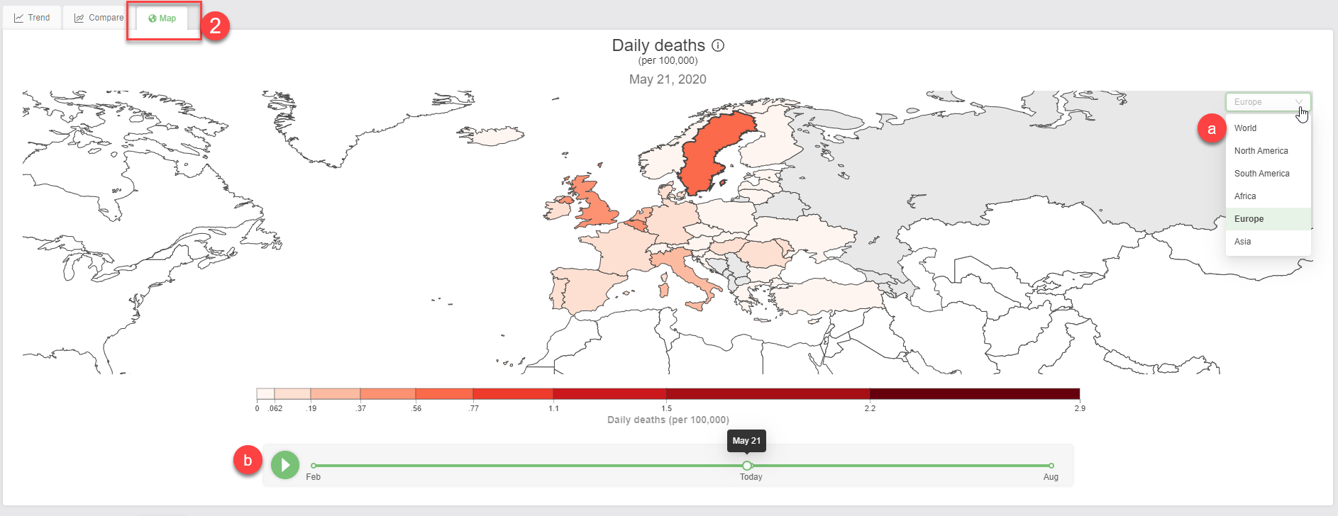
2. The Map view allows you to compare across locations (other states or countries depending on what location you are filtered on).
In the example below, we’ve chosen to focus on total deaths in Europe:
- Use the location selector at right to switch region.
- Click the play button to view how the numbers change across time.
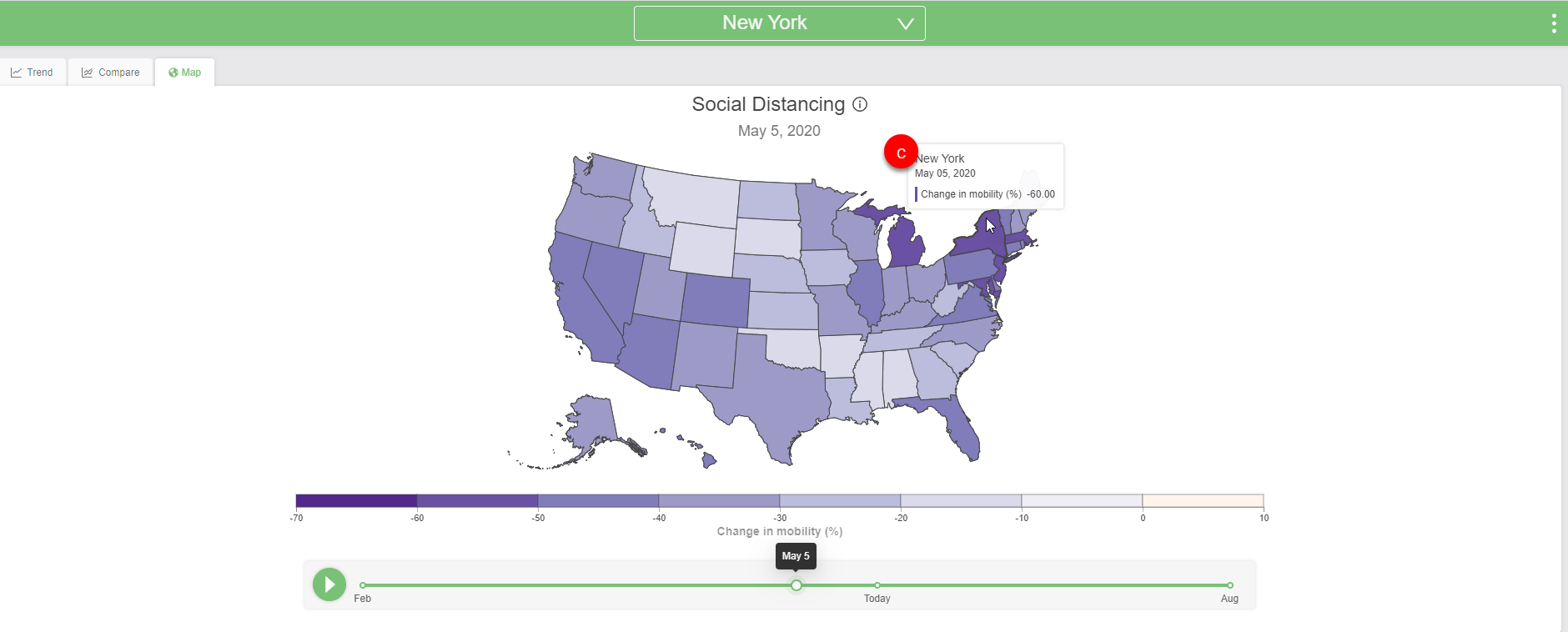
In this next example, we’ve selected NY again, to see how much mobility (measured via anonymous cellphone data) has changed in the US across time. Here we can see that:
- As of May 5, people in NY were moving around 60% less than they did in early February.
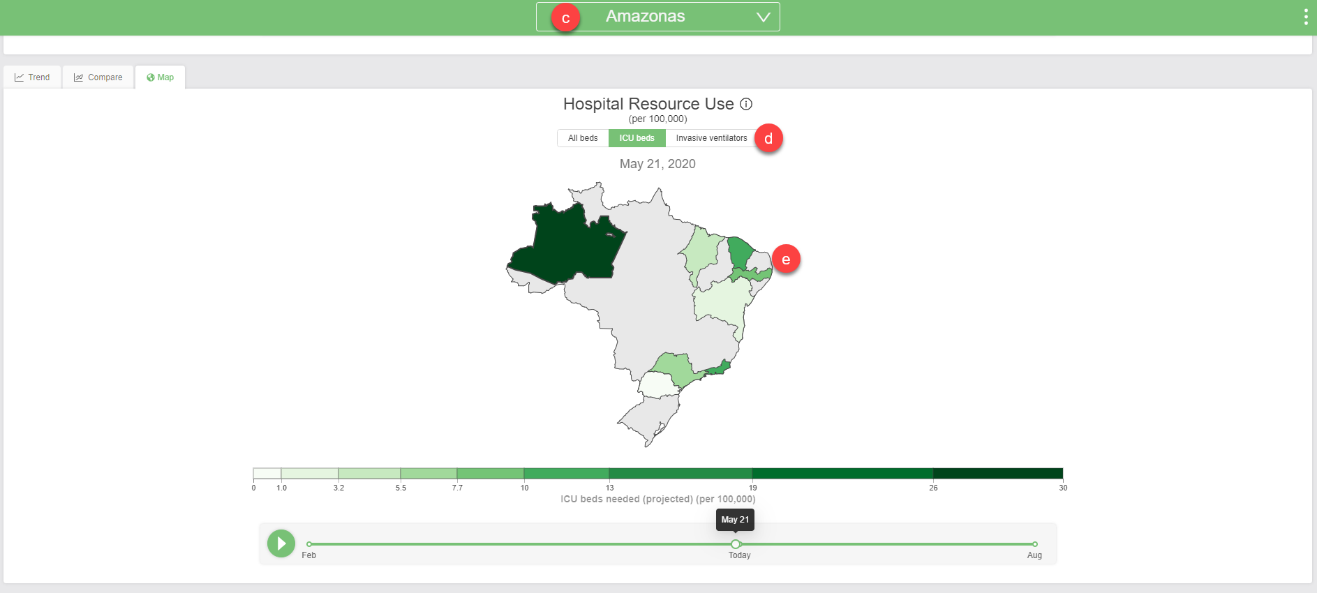
In this final example, we’re comparing hospital resource use across Brazil:
- You can type directly into the search bar to find a location, or click the search bar and scroll through to find a location. In this case, we chose Amazonas.
- Toggle between the different measures to see how they have changed across time.
- Since we have subnational estimates available for some of Brazil’s states, you can view how things differ across states.
