20 IHME Visuals Published in 2020
Published December 22, 2020

What a year. As we began preparing a slate of manuscripts for publication in early January, the COVID-19 pandemic began to silently devastate the world. A dedicated team of researchers quickly pivoted to model the impact of COVID-19 on 170 countries and territories, all while updating myriad models on a weekly basis and providing policy briefings to hospital system administrators, government officials, and the media. Meanwhile, other research teams and collaborators published over 100 studies in Nature, The Lancet, and the Journal of the American Medical Association, as well as other journals.
Below we’ve highlighted 20 figures from those studies that our researchers and collaborators published in journals in 2020. We’ve also highlighted data visualizations, infographics, GIFs, and designs from other IHME-affiliated projects such as our annual Roux Prize, which honors leaders in health metrics.
First, we’ll start with five COVID-related visuals:
20. There is an incredibly small amount of money dedicated to pandemic preparedness
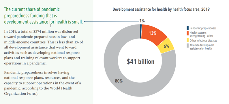
This figure from the 2019 Financing Global Health report drives home how small a fraction of development assistance for health (DAH) is devoted to pandemic preparedness. Less than 1% of all DAH was spent on developing national response plans and training relevant workers to support pandemic operations, just $374 million of a total $41 billion disbursed in low- and middle-income countries.
Though DAH for pandemic preparedness has grown faster than overall DAH over the past decade, there remains an urgent need to better understand ways to support pandemic preparedness and systems capable of mitigating or preventing pandemic like COVID-19.
Read Financing Global Health 2019 report published by IHME
19. This is how we’ll reduce chronic respiratory disease burden globally
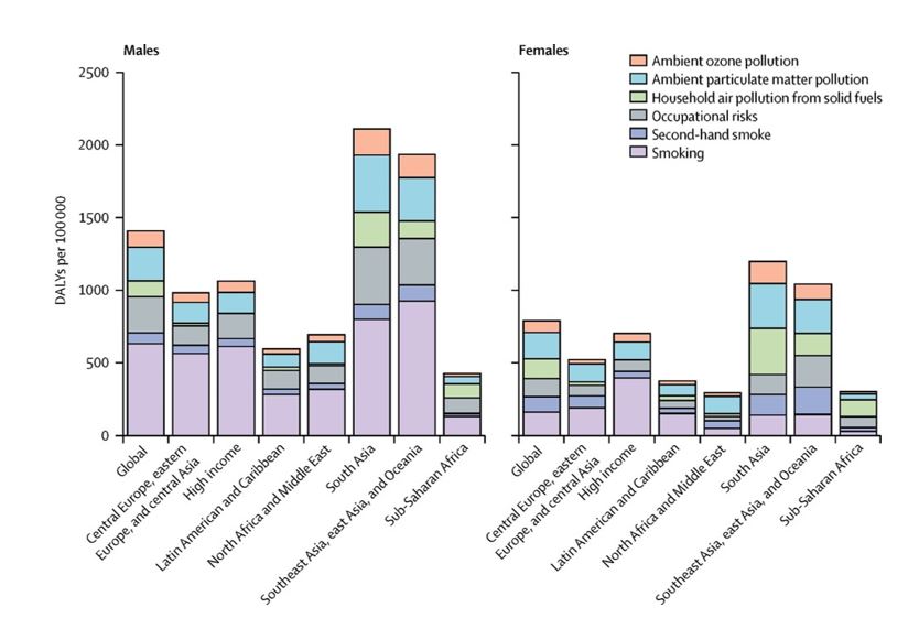
This figure shows the leading risk factors for chronic respiratory disease (which includes COPD, asthma, and several other diseases) for males and females in each Global Burden of Disease super-region in 2017. The findings are particularly relevant during the COVID-19 pandemic, as some chronic respiratory diseases are associated with higher risk of severe COVID-19 symptoms or death.
These data demonstrate how reducing the chronic respiratory disease burden in the future will require targeting different risk factors in different regions of the world, as well as in males versus females.
In every super-region, smoking was the leading contributor to the chronic respiratory disease burden among males in 2017 (see the light purple bars in the left figure), but ambient particulate matter pollution was the leading contributor globally among females (light blue bar) and was the main risk factor in North Africa and the Middle East, Southeast Asia, East Asia, and Oceania.
Household air pollution from solid fuels (light green bar) was the biggest risk in sub-Saharan Africa, while in South Asia, both forms of air pollution contributed equally to the burden.
Read Prevalence and attributable health burden of chronic respiratory diseases, 1990–2017: a systematic analysis for the Global Burden of Disease Study 2017 published in The Lancet
18. Hispanic or Latino Americans and non-Hispanic Black Americans are more likely to die from COVID-19 than non-Hispanic whites in the United States
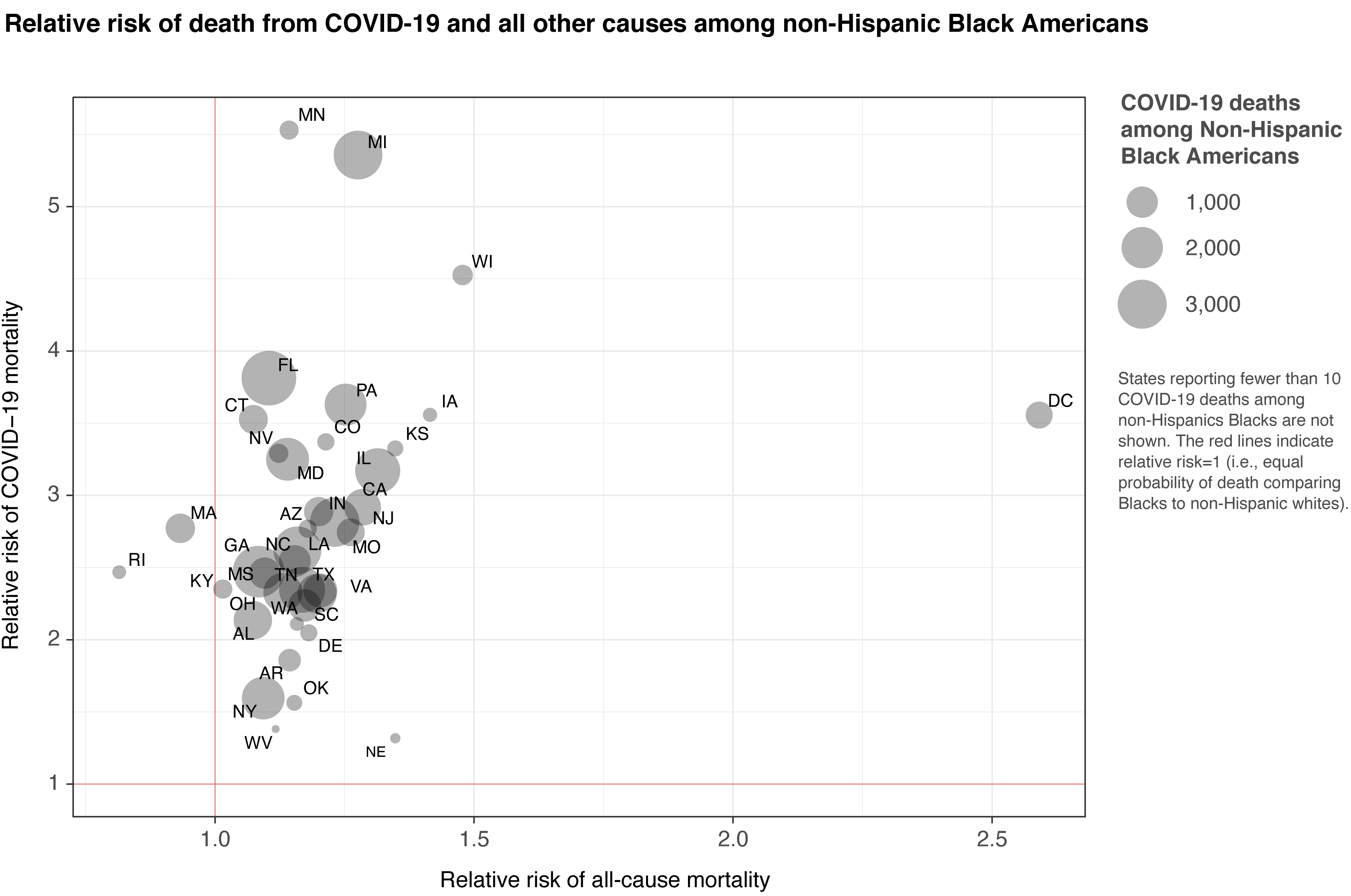
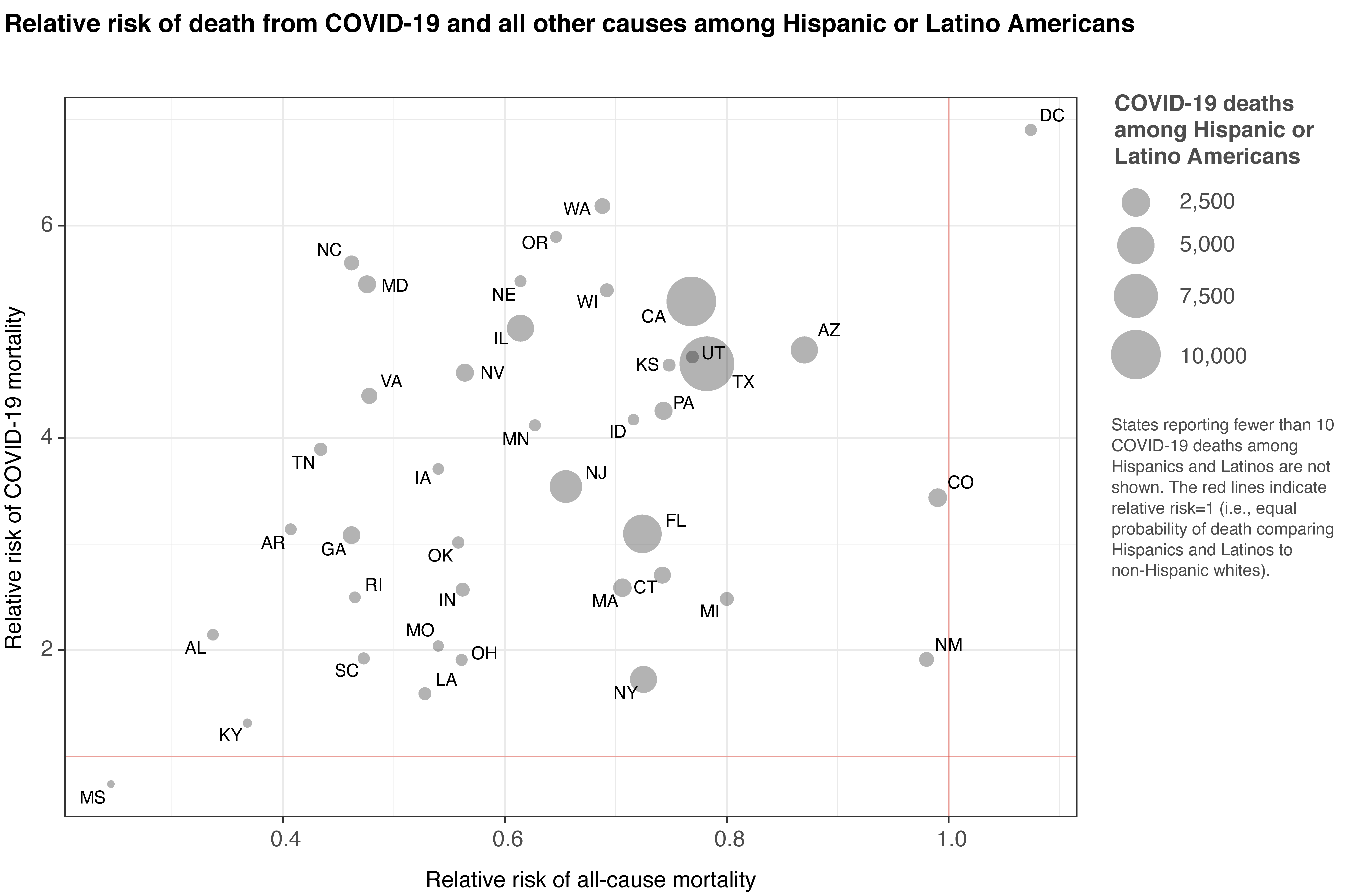
IHME analysis comparing the risk of dying from COVID-19 by race and ethnicity confirms that Hispanic or Latino Americans, and non-Hispanic Black Americans are more likely to die from COVID-19 than non-Hispanic whites. The excess risk is higher among younger age groups, indicating that work exposure is one potential source of this disparity. This highlights an opportunity to save lives by prioritizing interventions (such as masks and other PPE) at work and socially, and suggests higher-risk groups should be prioritized as vaccines and other treatments become available in the coming months.
The elevated risk in Hispanic, Latino, and non-Hispanic Black Americans means that their risk of death from COVID-19 at age 50 is equal to the risk of death for a 65-year-old non-Hispanic white American.
Read Prevent COVID-19 deaths by prioritizing interventions for Hispanic, Latino, and Black populations in the US published by IHME
17. What is mask use like in WHO regions? These infographics tell that story:
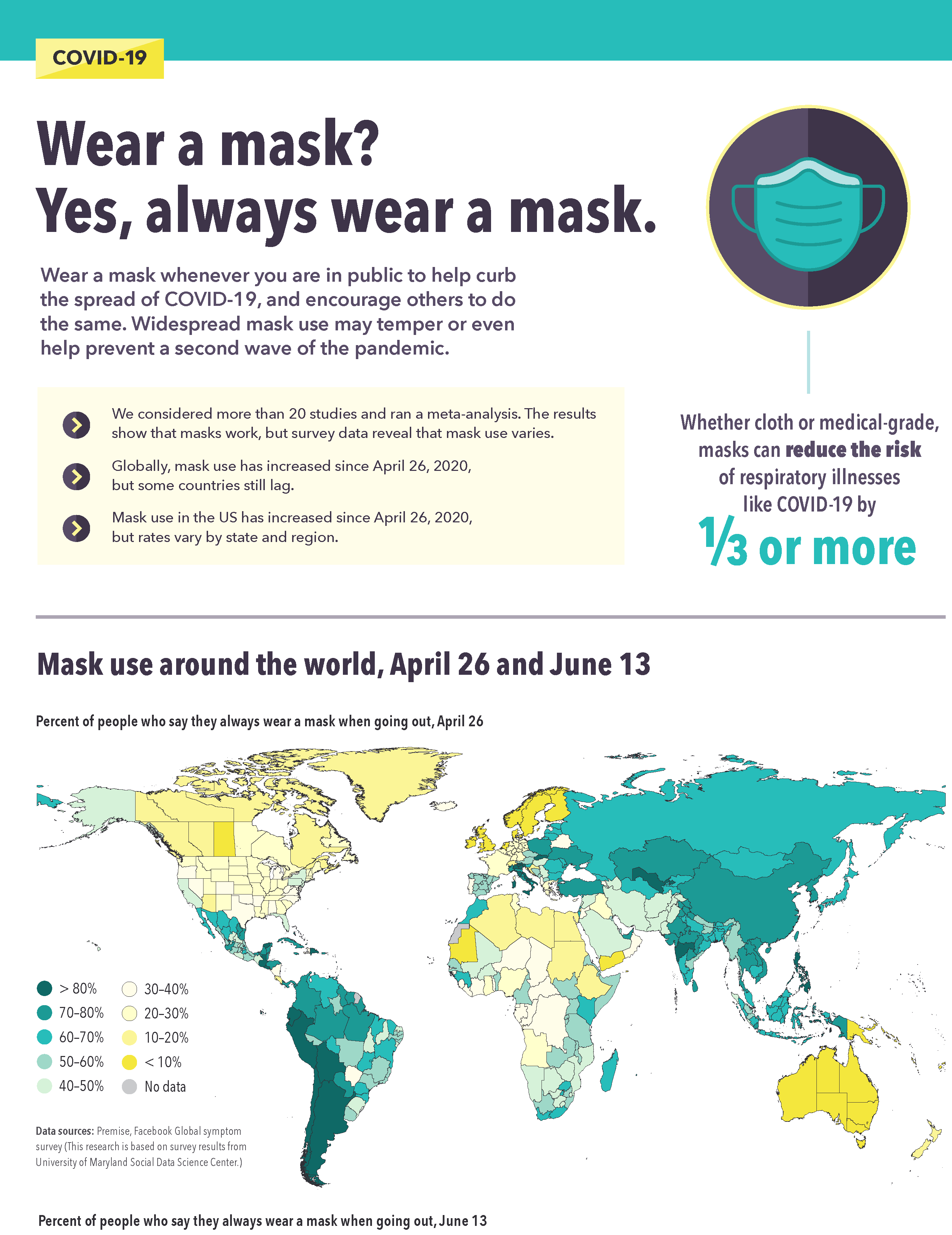
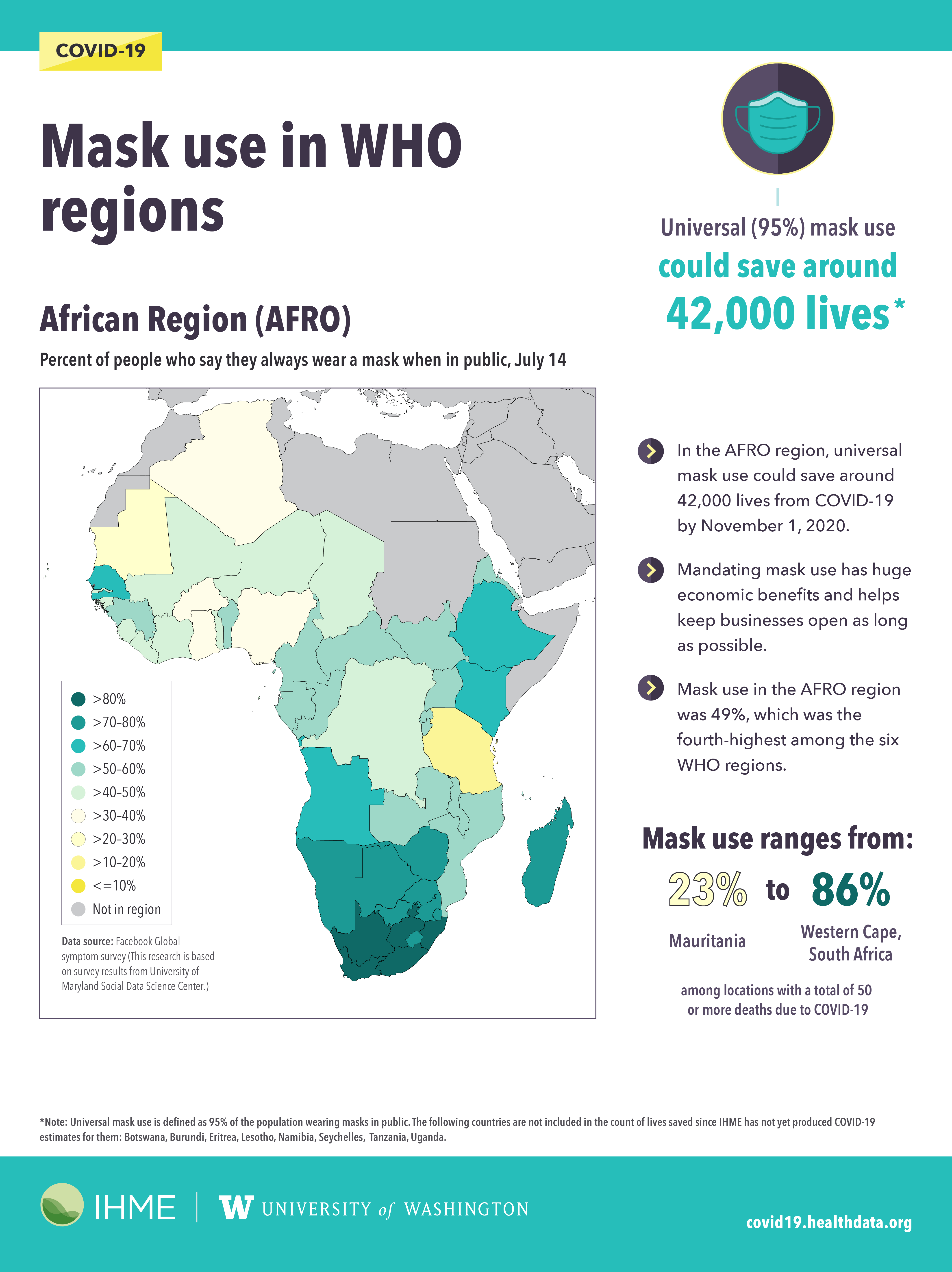
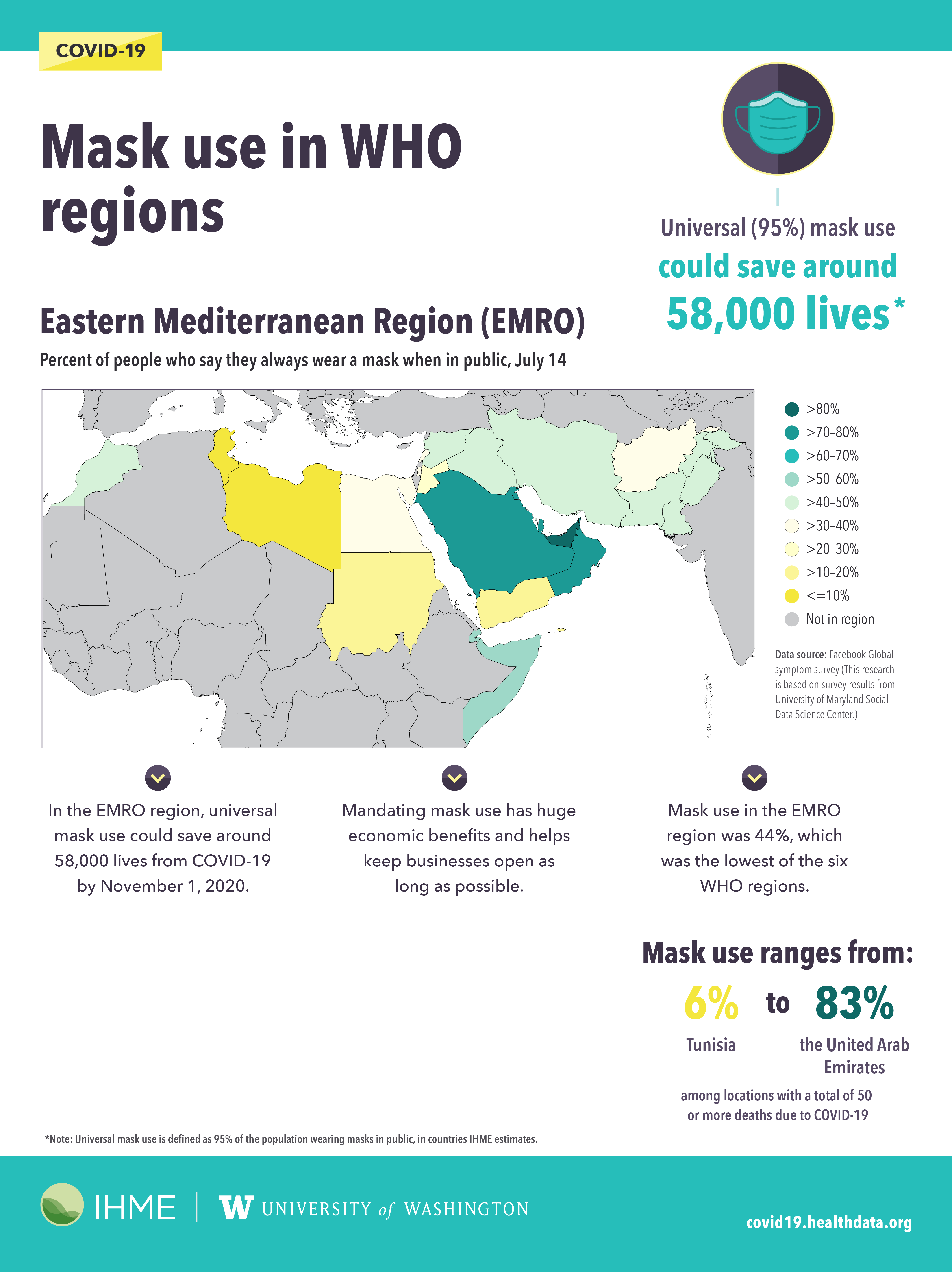
Our COVID-19 model projects that mask use (that’s 95% of a population wearing a mask outside of their homes) is likely to save more lives than a vaccine, even as vaccine rollout scales up.
These mask use maps of WHO regions published in July captures mask usage at a very specific moment in time, as the first wave of the pandemic was waning for many countries and territories. It tells a story of mask use compliance and the impacts of mandates on people’s health and the health of global economies. Data from the Facebook Global symptom survey (based on survey results from the University of Maryland Social Data Science Center) were used to create these infographics. The data reflect people who say they always wear a mask when in public, surveyed on July 14, 2020.
African Region: Mask use ranged from as low as 23% in Mauritania to as high as 86% in Western Cape, South Africa.
Eastern Mediterranean Region: Mask use ranged from as low as 6% in Tunisia to as high as 83% in the United Arab Emirates.
Region of the Americas: Mask use ranged from as low as 18% in British Columbia, Canada, to as high as 93% in Chile.
European Region: Mask use ranged from as low as <1% in Norway to as high as 81% in Castilla-La Mancha, Spain.
South-East Asia Region: Mask use ranged from as low as 39% in Manipur, India, to as high as 86% in Maluku, Indonesia.
Western Pacific Region: Mask use ranged from as low as 8% in Victoria, Australia, to as high as 86% in the Philippines.
16. Maps of mask use data around the world
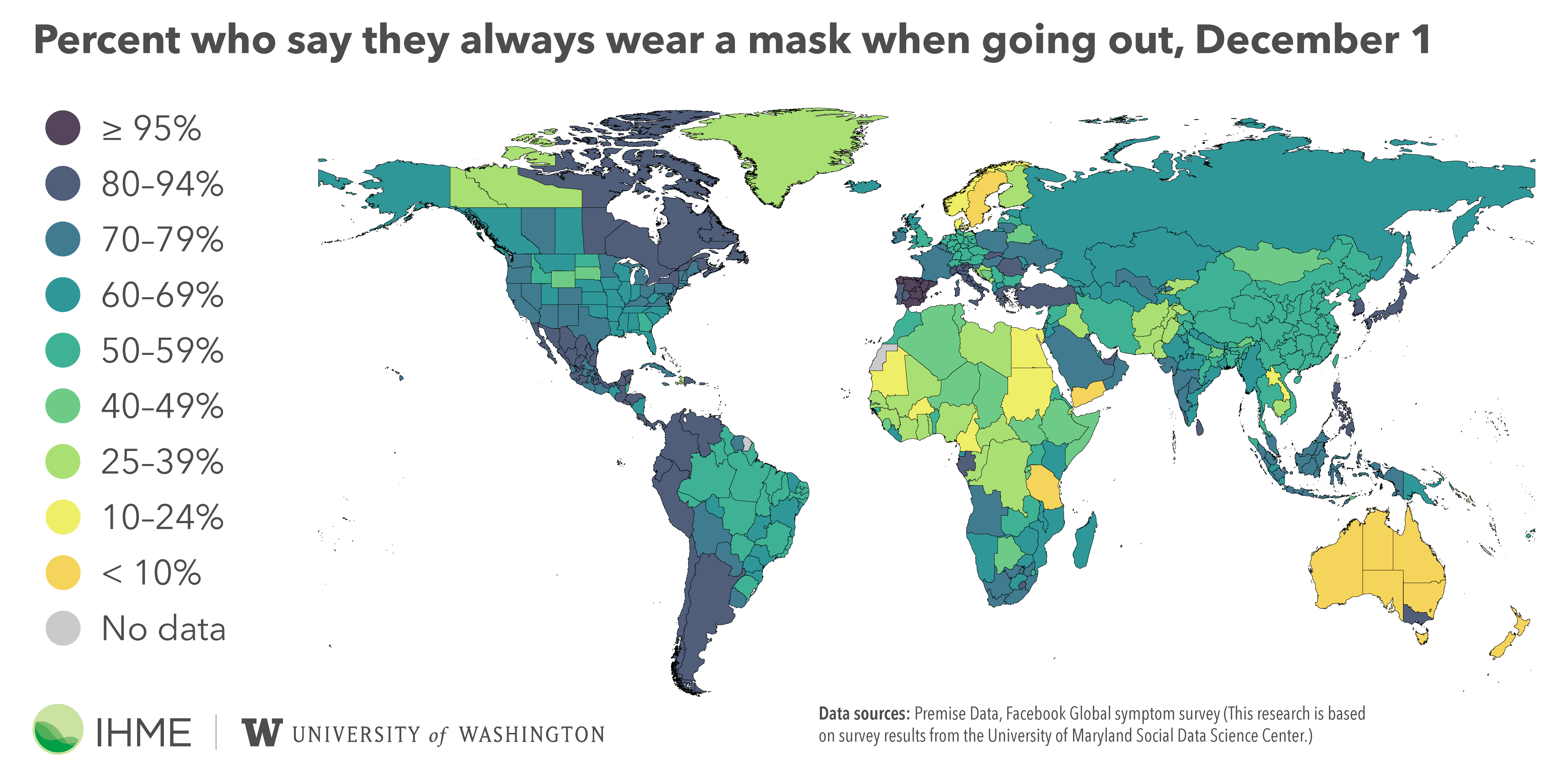
Research shows that both cloth and medical-grade masks can reduce the risk of COVID-19 transmission by 1/3 or more, so mask adoption became an important metric to track as the pandemic progressed. Research scientist Christopher Troeger created maps of mask use for the United States and the world. We continue updating these maps weekly.
15. Does mask wearing work? Oh, yes. We created a simulation that shows you just how effective it is:
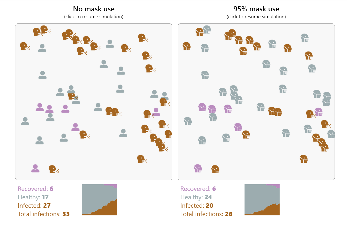
We’re all familiar with how mask use and social distancing help slow the spread of COVID-19, but what does the impact of those measures really look like? This simulation, built by IHME software developer Ryan Shackleton, demonstrates how both mask wearing and social distancing can contribute to reducing the virus’s transmission.
Masks don’t totally prevent infections for any given individual – they lower the overall rate of transmission, resulting in fewer infections over time. As governments around the world grapple with the challenge of keeping economies afloat while minimizing the death toll, many base their policy decisions on peak infection rates. With those numbers steadily creeping back up, communities will be forced to take drastic action. By not adhering to recommended guidelines for mask use and social distancing, we not only hasten the return to a strict lockdown, but also reverse much of the progress made so far.
14. Great news: progress has been made on lymphatic filariasis prevention and treatment!
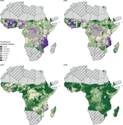
Lymphatic filariasis is a neglected tropical disease in which threadlike worms invade the lymphatic system. It causes swelling of the extremities and other permanent physical disfigurement. These maps of lymphatic filariasis prevalence in 2000, 2005, 2010, and 2018 in sub-Saharan Africa show how much progress has been made on lymphatic filariasis prevention and treatment over the past two decades.
In the map from 2000, many countries are predominantly shades of purple, meaning they have prevalence rates above 10%. Most of Mozambique is above 30% prevalence! The tiny bit of dark green on this map indicates places that have prevalence rates below 1%.
In the map from 2018, there are just a few small light purple sections remaining, in Côte d’Ivoire and Liberia, and some countries, such as Tanzania and Cameroon, are almost entirely under 1% prevalence. This progress highlights the effectiveness of mass drug administration.
Read The global distribution of lymphatic filariasis, 2000–18: a geospatial analysis published in The Lancet
13. Predicted global population decline over the next 80 years will have major implications for various global systems
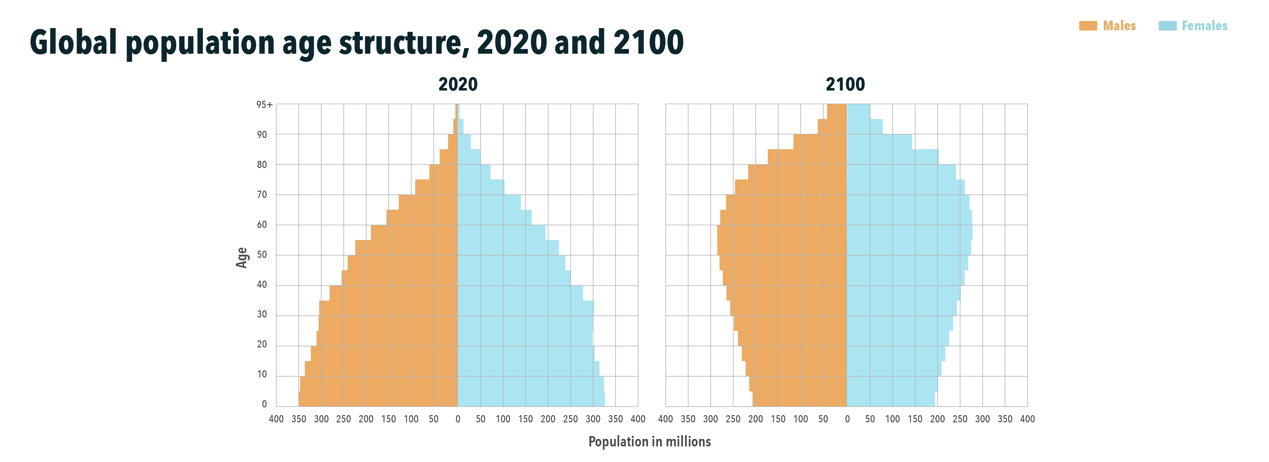
The population declines that many countries will experience in the next 80 years will have major implications for workforce, education, and health and social care planning, as well as an impact on economic growth, geopolitical stability, and the environment.
In 2100, if labor force participation by age and sex does not change, the ratio of the non-working adult population to the working population could reach 1.16 globally, up from 0.80 in 2017. This means that globally, each worker would have to support 1.16 non-workers over age 15.
Read Fertility, mortality, migration, and population scenarios for 195 countries and territories from 2017 to 2100: a forecasting analysis for the Global Burden of Disease Study published in The Lancet
12. Marked progress has been made on measles vaccine coverage since 2000, but inequalities in coverage persist between and within countries
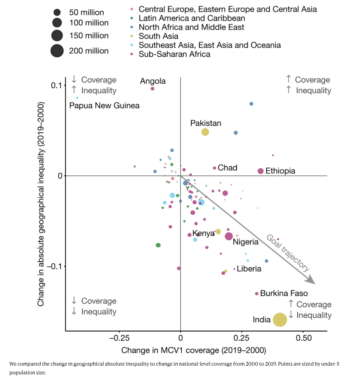
Absolute geographical inequality of MCV1 coverage in 2000 and 2019.
This figure illustrates changes in measles vaccine coverage (the proportion of the under-5 population that receives a dose of measles vaccine) in low- and middle-income countries from 2000 to 2019, as well as changes in how equitable vaccine coverage is within these countries.
Countries in the bottom right quadrant improved both their overall measles vaccine coverage and the geographical equality of that coverage, which is the goal. India and Burkina Faso stand out as making some of the biggest strides toward that goal, but many other countries are on the right trajectory as well. On the other end, countries like Angola and Papua New Guinea saw decreases in measles vaccine coverage and increases in geographical inequality, meaning that a smaller proportion of children under 5 years old were being vaccinated in these countries in 2019 than 20 years prior, and the distribution of vaccines within these countries was less equitable.
These results, alongside others in the paper, can help policymakers identify populations not receiving adequate measles immunization coverage and work to provide equitable disease protection for all children in the future. The findings are particularly relevant as countries prepare to distribute limited quantities of COVID-19 vaccines, for which geographical inequalities in coverage are likely to be even more pronounced.
Read Mapping routine measles vaccination in low- and middle-income countries published in Nature
11. This is how many diarrhea deaths per 1,000 children were averted between 2000 and 2017:
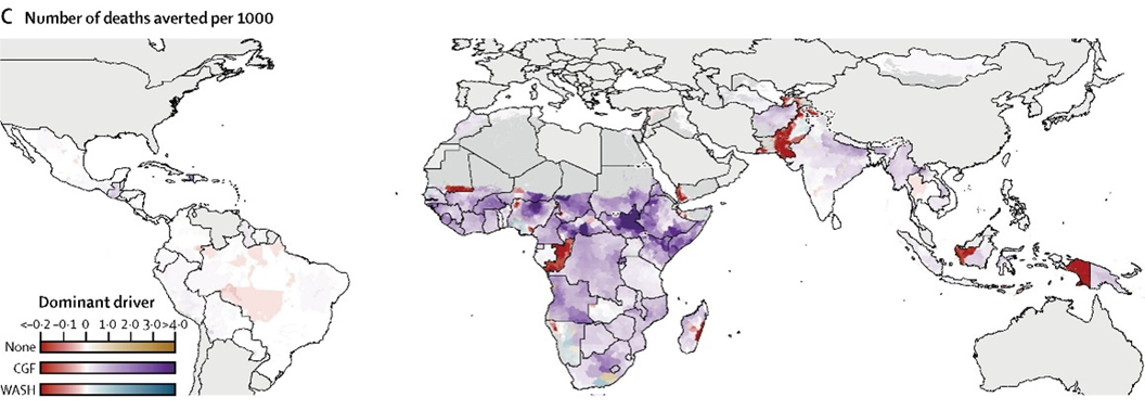
Number of deaths averted per 1,000 children with color scale driven by improvements in key risk factors implemented from 2000 to 2017.
You’re looking at a map of estimates of how many diarrhea deaths per 1,000 were averted between 2000 and 2017 by improvements in the dominant driver of diarrhea death in these locations: either lack of clean water, sanitation, and hygiene (WASH); child growth failure; or no dominant driver. Purple indicates locations where reductions in child growth failure from 2000 to 2017 had the biggest impact on reductions in the rate of diarrhea death. The darker purple, the more deaths per 1,000 that were prevented as a result of reductions in child growth failure, such as in South Sudan.
We can see that declining child growth failure was the biggest overall driver of diarrhea death rate reductions, since most of the map is a shade of purple. Blue indicates locations where increases in access to improved water, sanitation, and hygiene from 2000 to 2017 had the biggest impact on reductions in the rate of diarrhea death. This was the dominant driver in only a few countries and didn’t have as big an impact on death rates as child growth failure – note that the places in blue are lighter blue (see Angola, for example).
Read Mapping geographical inequalities in childhood diarrhoeal morbidity and mortality in low-income and middle-income countries, 2000–17: analysis for the Global Burden of Disease Study 2017 published in The Lancet
10. There are fewer males smoking tobacco in Brazil!
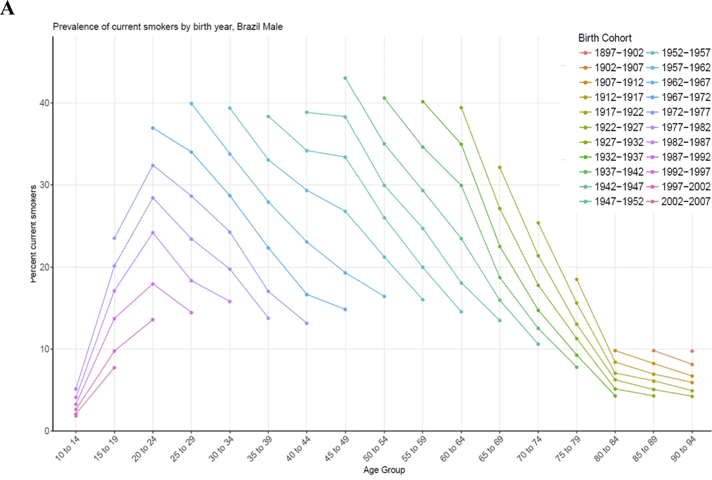
Prevalence of smokers by age group and birth-year cohort in Brazil for males.
This fascinating figure shows the ages at which the largest proportion of the male population in Brazil smoked, and also how those trends have changed over time. The first big takeaway from this figure is that for each birth cohort featured, smoking rates peaked among 20–24 year olds. That is to say that starting at 10 years old, Brazilian males progressively took up smoking and continued through ages 20–24, but then more and more of them quit smoking after the age of 24. We can see this in the pink and purple lines that peak at 20 to 24 and then steadily decline.
The second big takeaway from this figure is that each progressively younger birth cohort had lower smoking rates at every age. For instance, when the male population born in 1942–1947 was 45–49 years old, over 40% of them were smokers (the highest point in the figure), compared to slightly less than 40% of 45–49 year olds born in 1947–1952, and so on down. When the population born in 1967–1972 was 45–49 years old, only about 15% of them were current smokers. If current trends continue, younger birth cohorts who have not yet turned 45 years old will have even lower smoking rates when they reach this age.
Read Trends in prevalence and mortality burden attributable to smoking, Brazil and federated units, 1990 and 2017 published in BMC
9. Trends in congenital heart disease in infants between 1990 and 2017
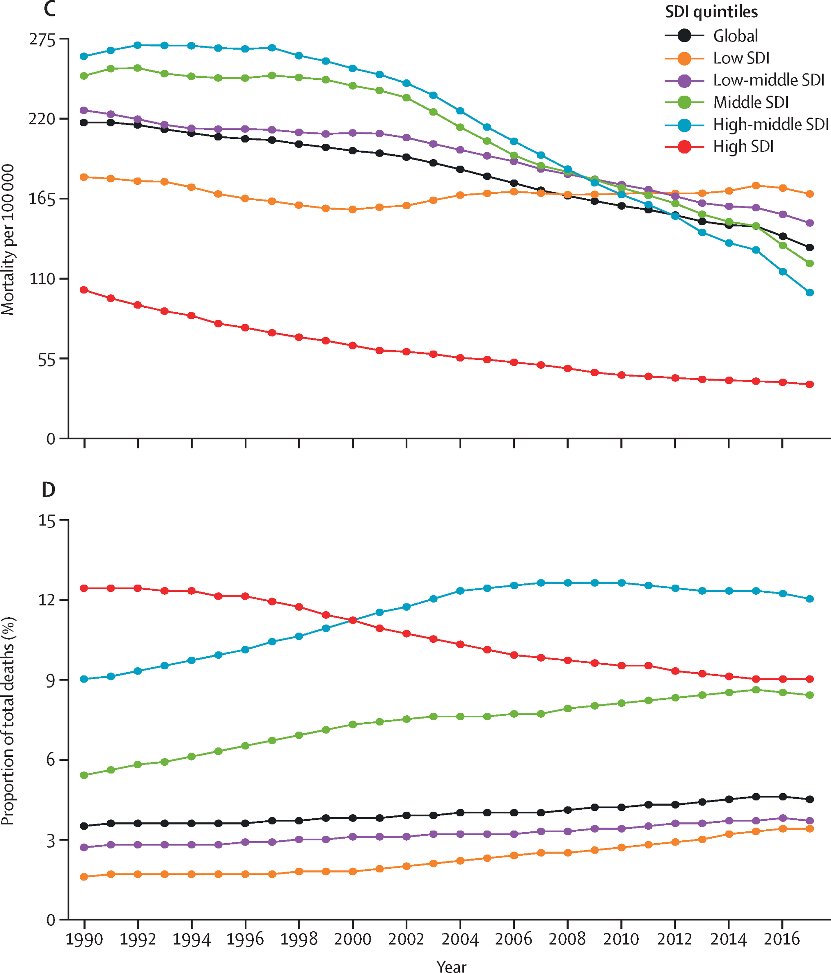
Mortality of congenital heart disease in children under 1 year of age by SDI quintile, 1990–2017
(C) Mortality per 100,000 infants by SDI quintile from 1990 to 2017. (D) Proportion of infant deaths by SDI quintile from 1990 to 2017.
This figure highlights important trends in congenital heart disease deaths in infants (children under 1 year old) from 1990 to 2017. In 1990, the high-middle Socio-demographic Index (SDI) quintile had the highest infant mortality rates, followed by the middle SDI quintile and then the low-middle (top figure). SDI is a summary measure that identifies where countries or other geographic areas sit on the spectrum of development. Over the course of the next 27 years, each quintile’s ability to prevent congenital heart disease was correlated with its SDI status, so the high-middle quintile saw the largest declines, then the middle, and then the low-middle. But all three quintiles saw substantial declines. Unfortunately, the low SDI quintile’s congenital heart disease infant mortality rates remained stagnant from 1990 to 2017.
For the bottom figure, the most interesting trend is that the high SDI quintile experienced a decline in the proportion of total infant deaths due to congenital heart disease, while all four other SDI quintiles experienced increases. This means that in recent years, other than in the high SDI quintile, countries’ health care systems have had to handle more infant congenital heart disease deaths relative to other causes of infant mortality. This is especially true in the middle and high-middle SDI quintiles.
Read Global, regional, and national burden of congenital heart disease, 1990–2017: a systematic analysis for the Global Burden of Disease Study 2017 published in The Lancet
8. Spending on HIV/AIDS in low-income and middle-income countries, 2000 to 2017
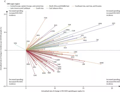
HIV/AIDS spending in low-income and middle-income countries. AFG=Afghanistan. ARM=Armenia. AZE=Azerbaijan. BFA=Burkina Faso. BLR=Belarus. BWA=Botswana. CHN=China. CMR=Cameroon. COM=Comoros. CUB=Cuba. DZA=Algeria. FSM=Federated States of Micronesia. GAB=Gabon. GBD=Global Burden of Diseases, Injuries, and Risk Factors Study. GEO=Georgia. GMB=The Gambia. KHM=Cambodia. LBR=Liberia. MHL=Marshall Islands. MMR=Myanmar. MNG=Mongolia. MOZ=Mozambique. MUS=Mauritius MWI=Malawi. NER=Niger. PAK=Pakistan. RUS=Russia. RWA=Rwanda. SWZ=eSwatini. TJK=Tajikistan. TLS=Timor-Leste. VEN=Venezuela. YEM=Yemen. ZWE=Zimbabwe.
This figure dramatically demonstrates the relationship between HIV/AIDS funding and HIV/AIDS incidence in low- and middle-income countries from 2000 and 2017 (in annualized rates of change). Every country in the figure but Venezuela increased its HIV/AIDS spending per capita since 2000, but only about half of those countries saw an associated decrease in HIV/AIDS incidence. The red lines represent sub-Saharan African countries and clearly demonstrate that sub-Saharan Africa had better HIV/AIDS outcomes alongside increased spending than other super-regions.
While this figure says nothing about causality – it is just establishing a correlation – perhaps countries high in the upper right quadrant (such as Georgia and Armenia), which saw large increases in HIV/AIDS incidence alongside large increases in HIV/AIDS spending, could learn something about HIV/AIDS prevention from countries in the lower right quadrant (such as Gabon, Cambodia, and Niger). It suggests not all HIV/AIDS spending is created equal, and/or there are factors beyond spending that impact HIV/AIDS incidence rates.
Read Health sector spending and spending on HIV/AIDS, tuberculosis, and malaria, and development assistance for health: progress towards Sustainable Development Goal 3 published in The Lancet
7. What is funding for global health being spent on? Financing Global Health 2019 shows exactly that:
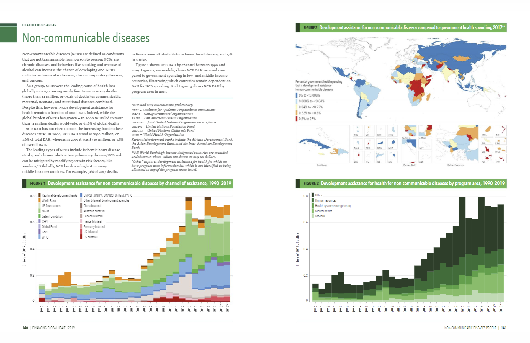
Global health financing profile: Non-communicable diseases
New in the annual Financing Global Health report, our global health financing profiles took things to another level by offering detailed development assistance for health (DAH) data on a total of 14 funding sources and channels, as well as five health focus areas. We also presented detail on other European and non-European government-sourced DAH, an overview of the Global Fund and UN agencies as channels, and explorations of health focus areas not covered in depth elsewhere in the report.
In the introduction of this report, we provided a broad overview of total health spending for 195 countries, from 1995 to 2017. We also explored the underlying theme of Financing Global Health 2019, examining health spending trends through the frame of Sustainable Development Goal 3, which aims to “ensure healthy lives and promote well-being for all at all ages.” Adopted in 2015, as part of the 2030 Agenda for Sustainable Development, the Sustainable Development Goals (SDGs) are the core of a plan to, according to the United Nations, provide “a shared blueprint for peace and prosperity for people and the planet, now and into the future.”
Overall, global health spending has increased over the last year, reaching $7.9 trillion (95% uncertainty interval 7.8–8.0) in 2017, the most recent year for which total health spending data are available. By type of spending, the 2017 total breaks down as follows:
$4.8 trillion (4.7–4.9), or 60.7%, government health spending
$1.6 trillion (1.6–1.7), or 20.6%, prepaid private spending
$1.5 trillion (1.4–1.5), or 18.5%, out-of-pocket spending
$40.6 billion, or 0.5%, donor financing
Read the 2019 Financing Global Health report
6. And the 2020 Roux Prize winner is [are] … Kristin Braa and Jørn Braa!

Kristin Braa & Jørn Braa, professors at the University of Oslo, were the recipients of the 2020 Roux Prize for turning evidence into health impact. This sibling duo developed DHIS2, the largest health information system, as a global public good used in 73 countries.
The DHIS2 is a low-cost, open-source tool for collecting and analyzing health data at the community level, enabling countries to make the best-informed public health decisions possible.
While calling for nominations for this year's annual Roux Prize, our graphic designers revisited the work of the previous winners, such as Dr. Agnes Binagwaho, who won the Roux Prize in 2015 for using GBD data to tackle one of Rwanda's most important public health issues, household air pollution.
Learn more about the Roux Prize
5. Burden of neurological disorders in Europe in 2017
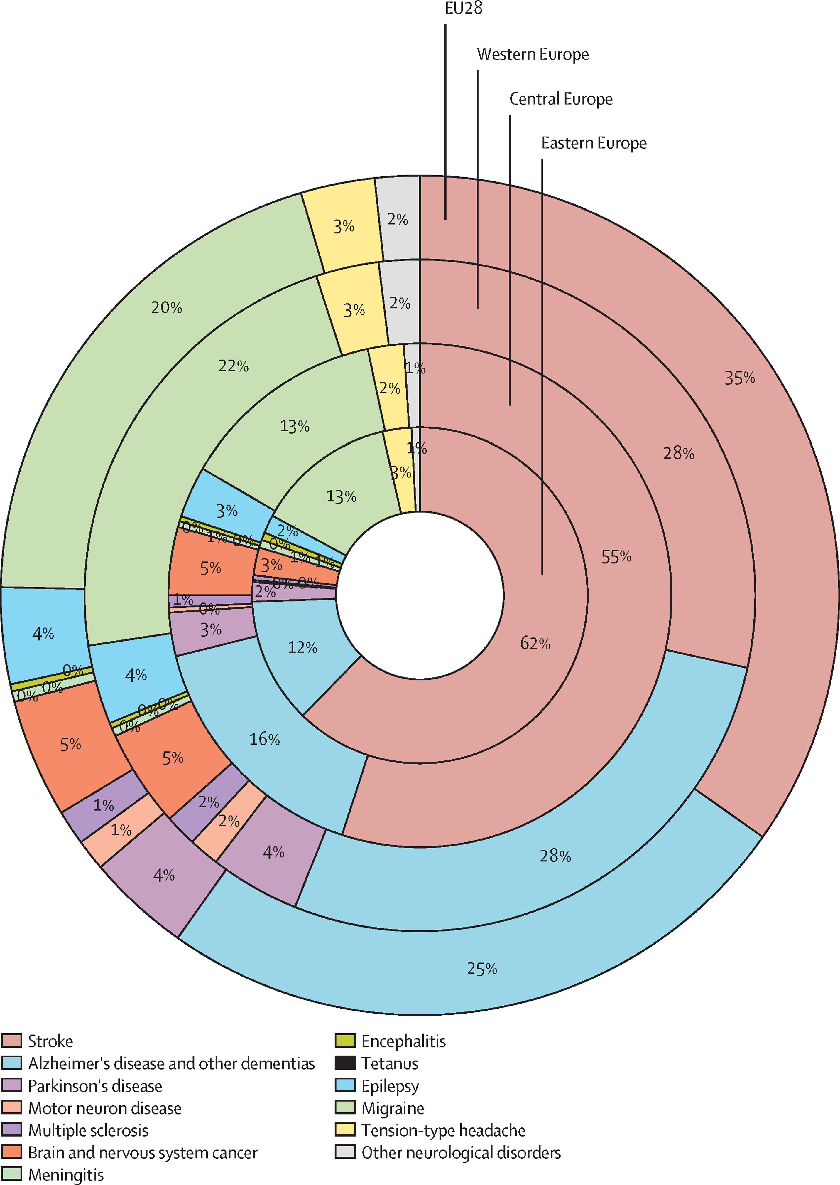
Contribution of each disease to the overall burden of neurological disorders in the EU28, Western, Central, and Eastern Europe in 2017. Percentages represent proportions of DALYs. DALYs=disability-adjusted life years. EU28=the 27 countries in the EU plus the UK.
The seldom-used concentric circle format was an effective way to show proportional burden in different locations. It highlights similarities and differences between the leading neurological disorders in Western, Central, and Eastern Europe (as well as EU28).
Stroke contributed more than twice as much to the neurological disorder burden in Eastern Europe than in Western Europe, and on the flip side, Alzheimer’s and migraine contributed approximately twice as much to the neurological disorder burden in Western Europe than in Eastern Europe.
Read The burden of neurological diseases in Europe: an analysis for the Global Burden of Disease Study 2017 published in The Lancet
4. Number of deaths due to unintentional drowning by age group, sex, and super-region in 2017
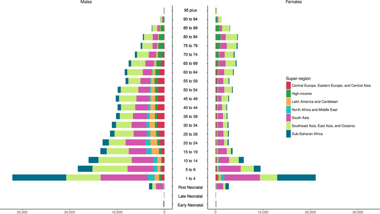
Number of deaths due to unintentional drowning by age group, sex, and super-region in 2017.
Packing a lot of information in an easily digestible format, this figure shows where drownings occur and among which populations. It is interesting that sub-Saharan Africa looks to have had a similar number of unintentional drowning deaths in the 1–4 year age group in 2017 as South Asia, and a lot more than Southeast Asia, East Asia, and Oceania, but then for every age group older than 4 years, sub-Saharan Africa had far fewer deaths than either of the other two super-regions. It is also interesting that for males, the total number of deaths in each 5-year age group declined with each older age group after post neonatal (as in, 5–9 year olds had fewer deaths than 1–4 year olds, and 10–14 year olds had fewer deaths than 5–9 year olds, and so on), but for females, some of the older age groups had more deaths than the middle-age age groups (e.g., more deaths in the 80–84 year age group than the 40–44 year age group).
In general, females had lower numbers of unintentional drowning deaths than males, but that difference was particularly stark for Central Europe, Eastern Europe, and Central Asia; Latin America and the Caribbean; and North Africa and the Middle East. The deaths in those super-regions were lower than in the super-regions highlighted above but still clearly visible on the male side of the figure – and almost nonexistent on the female side of the figure.
Finally, it’s notable that there were so few drowning deaths in the high-income super-region in the younger age groups but so many (relative to other age groups and super-regions) in the older age groups.
Read The burden of unintentional drowning in BMJ Injury Prevention.
3. India is projected to meet Sustainable Development Goals for under-5 mortality rate in most districts by 2030
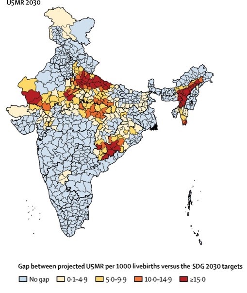
Gap between the projected U5MR in the districts of India in 2030 based on trends from 2000 to 2017 versus the SDG 2030 targets. U5MR=under-5 mortality rate. SDG=Sustainable Development Goal.
At a glance, this map shows that the vast majority of districts in India are projected to meet the 2030 Sustainable Development Goals (SDGs) target for under-5 mortality (see light blue districts) based on current trends. The SDG target is fewer than 25 deaths per 1,000 live births for children under 5 years old. This means that most districts have made substantial progress on child mortality in recent years!
Read Subnational mapping of under-5 and neonatal mortality trends in India: the Global Burden of Disease Study 2000–17 published in The Lancet
2. Universal health coverage globally will improve everyone’s lives
3.1 billion people will likely still lack effective health service coverage in 2023, with 968 million of those residing in South Asia. This falls short of the World Health Organization (WHO) goal of 1 billion more people benefiting from universal health coverage (UHC) between 2019 and 2023, and is what researchers found in a systematic analysis of UHC.
Universal health coverage is defined as all people receiving quality health services without incurring financial hardship. Researchers focused in this paper only on measuring service coverage, developing a new framework to capture how well countries align health services with the needs of the population and how well or poorly those services contribute to people’s health.
Using 23 indicators, the researchers assessed effective coverage by country on a scale of 1 to 100 and measured progress between 1990 and 2019. Globally, UHC effective coverage performance improved by nearly 15 points over that time period, but large variations remained across countries and regions, ranging from over 96 to below 25. Japan had the highest effective coverage score (96.4) in 2019, followed by Iceland, Norway, Switzerland, and San Marino. The Central African Republic, Somalia, Chad, Guinea, and Vanuatu had the lowest performance on UHC effective coverage.
The study was completed prior to the COVID-19 pandemic but provides an important benchmark for measuring the impact of the pandemic and progress on UHC in years to come.
Read Measuring universal health coverage based on an index of effective coverage of health services in 204 countries and territories, 1990–2019: a systematic analysis for the Global Burden of Disease Study 2019(link is external) published in The Lancet
1. Non-communicable diseases are in the spotlight for the Global Burden of Disease 2019 study

The latest findings from the Global Burden of Disease study provide new insights on how well countries were prepared in terms of underlying health for the COVID-19 pandemic, and set out the true scale of the challenge to protect against further pandemic threats.
The study also reveals that the rise in exposure to key risk factors (including high blood pressure, high blood sugar, high body mass index [BMI], and elevated cholesterol), combined with rising deaths from cardiovascular disease in some countries (e.g., the US and the Caribbean), suggests that the world might be approaching a turning point in life expectancy gains.
The authors stress that the promise of disease prevention through government actions or incentives that enable healthier behaviors and access to health care resources is not being realized around the world.
Explore the 2019 Global Burden of Disease study published in The Lancet